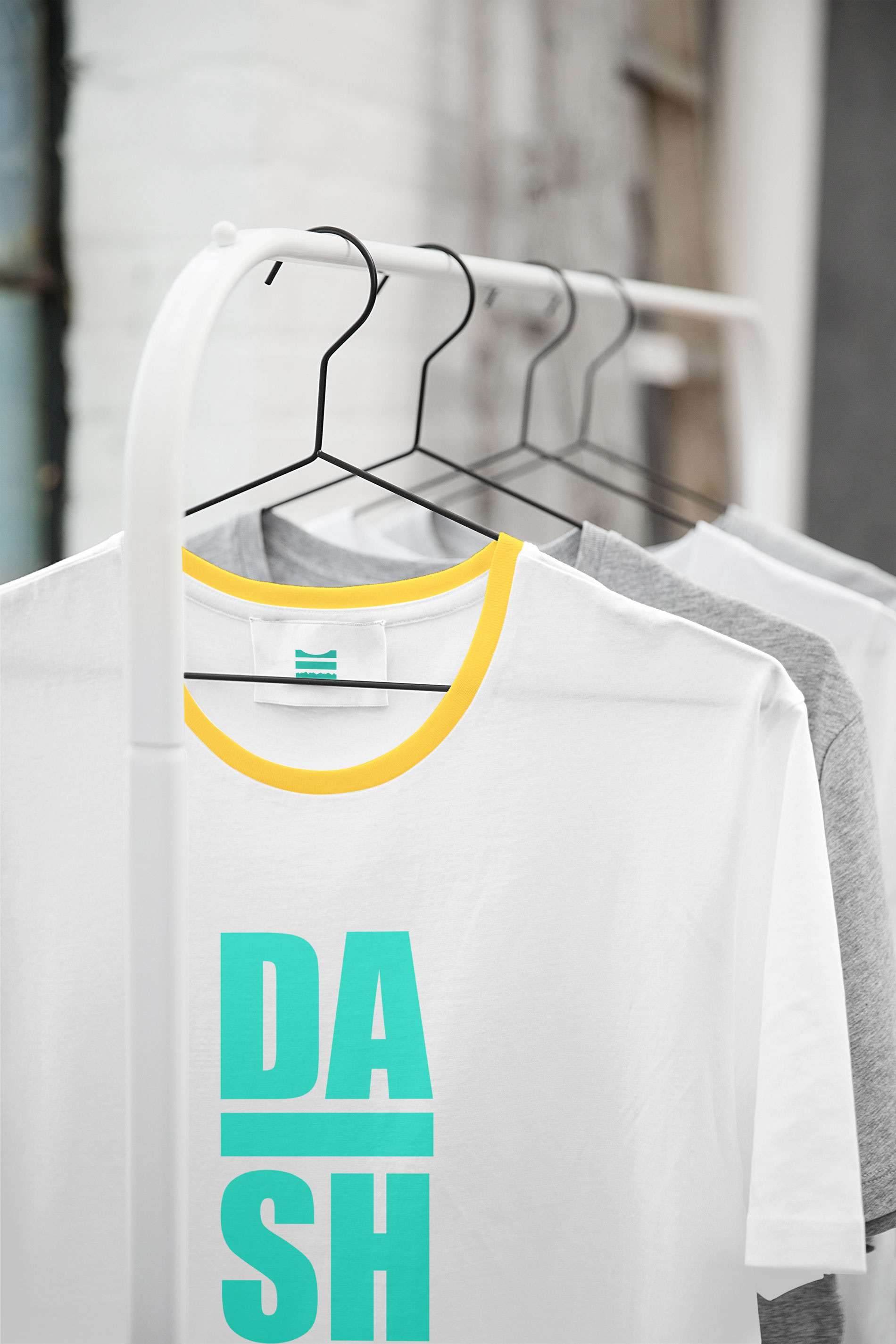
DASH
Naming
Concept
Creative Direction
Brand identity
Visual Identity
Brand Guidelines
Graphic Design
Snowboard Brand for Children
Brief:
Branding a snowboard for children, craft its visual identity and design assets that reflect the personality of the brand.
The Idea:
DASH is a brand for snowboard child prodigies, specialised in freestyle - all mountain boards.
It is THE brand that groms choose for intensive training and competition.
Concept:
DASH means energy, adventure, spirit, verve, boldness.

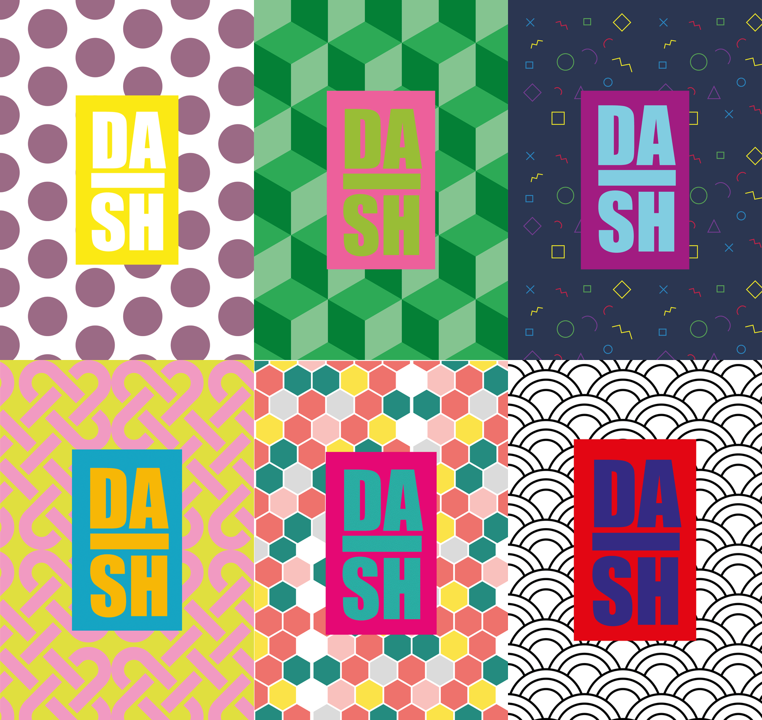
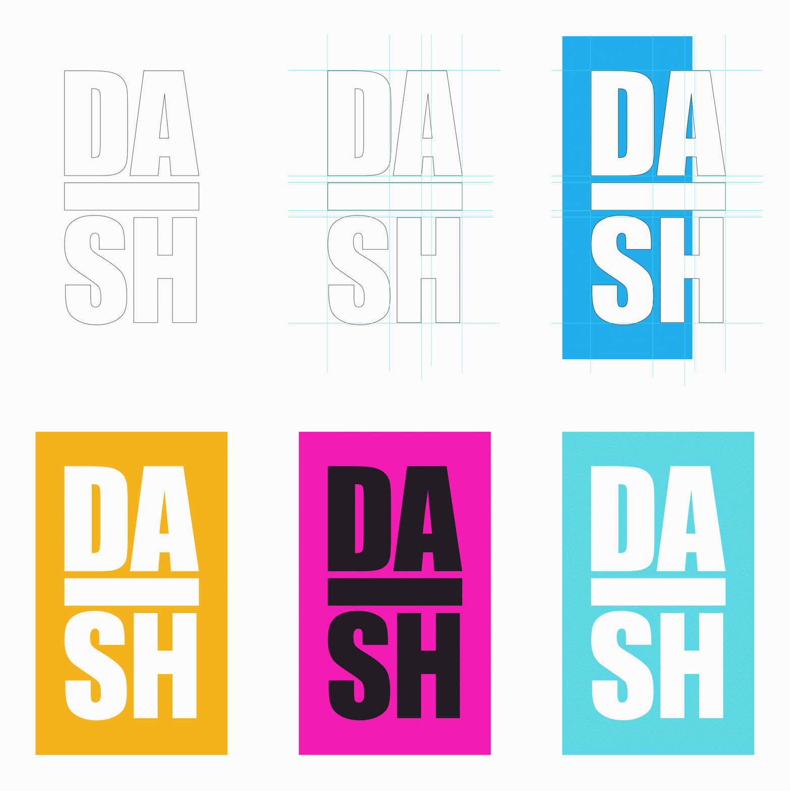
The identity is based on typographic elements and a specially developed colour scheme with vivid hues that reflect the energetic personality of the brand.
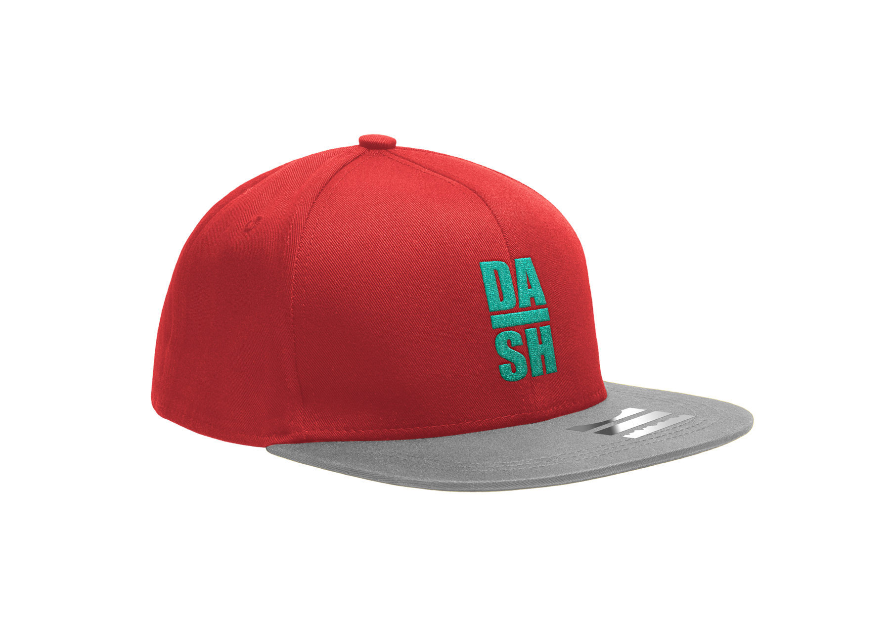
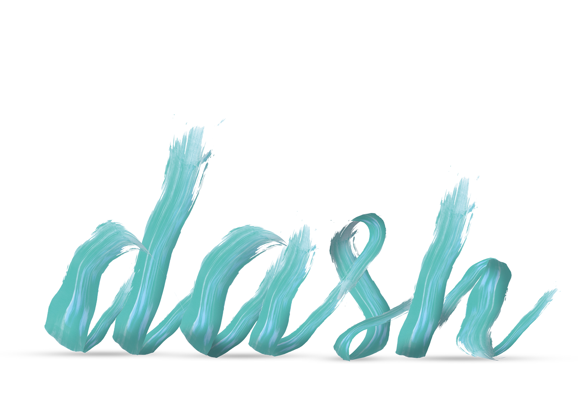
The logotype is a play on the double meaning of the word "DASH" and can be used stand-alone or in combination with colour and pattern backgrounds, opening the possibility for endless variations.



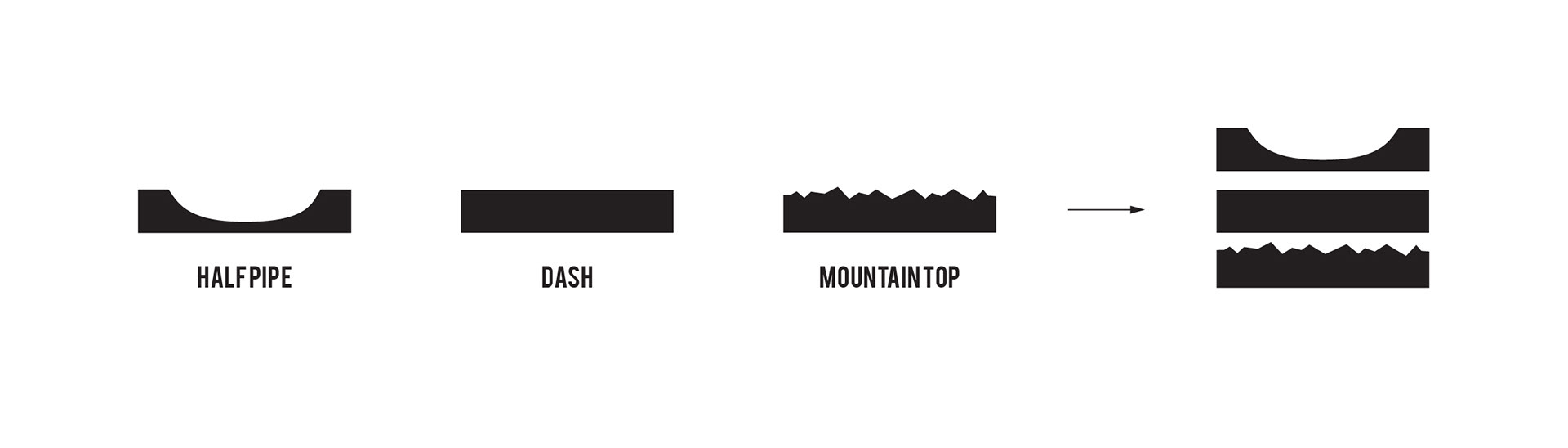
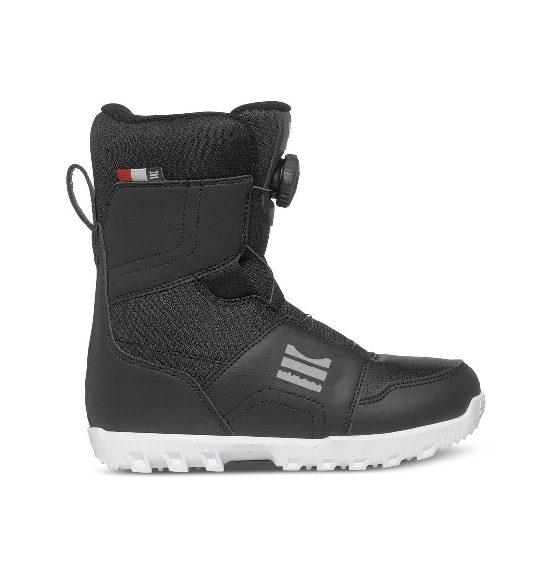
In addition to the logotype, I developed a secondary brand element, that is easily recognisable and it's a simple graphic translation of the core of the brand.